Wet Felting - 4 week project
In order to properly display my my canvas' for my '4 week project', i intended to learn how to 'felt' wool. I believe that this would give my overal canvas a much more maluble, 3D design.
Initial inspiration for this came from the Artist 'Robert Morris' whose 'Felt Triangle' seemed to posess the same attribtes i intended for my own work. The powerful lines, yet bedraggled features, to me suggested easily the interlocking but juxtaposing componants the sea has.
Saturday, 3 November 2012
Friday, 26 October 2012
Wednesday, 17 October 2012
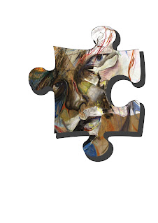
- Create a clipping mask on text and photoshop symbols -
Go to File > New to open up a new document. Choose preset> International paper and size A4.
Choose a text style or shape and type a word on the new document.
Open up any image of your choice.
Use the move tool to drag your image over the top of your text/symbol. ( The image layer should be on top of the text layer in the layer palette.
Ensure that you are on the image layer and choose Layer >create clipping mask (the image should now appear inside the text). YOu can move the image around tand place where you need to.
 Select the text layer and in the layers palette at the bottom, second icon on the right ( add layer style) select drop shadow from the list and experiment with distance, spread and size untill you have the disired effect.
Wednesday, 10 October 2012
After using blocks of paint to recreate an outside environment, i decided to look into createing my own. This piece is taken from an outside veiw of two parralel rooms, I loved the juxtaposing colours within both. One being cool and fresh - mostley Greens. While the other was much warmer burnt oranges' and terracotta. Once this was complete i decided to give it some perspective as a picture, I framed the rooms in Black Biro, which allowed me to create a definitve line. Unifying the the colour and providing the viewer with a more interesting ocular experience.
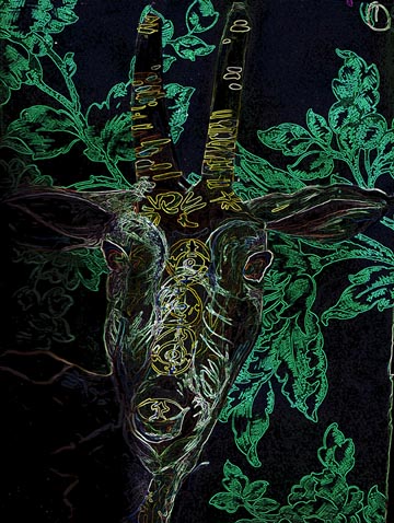
After photographing some original work, i uploaded it to an AppleMac. Then put it into 'PhotoShop'. From this i was able to manipulate the image so that pieces of the dear were lost while others took on a more electric fibrous element which gave the appearance that the picture was glowing. I particularly liked this affect as it seemed a more modern outlook on the original.
Wednesday, 3 October 2012
Most of the cliff shots look a little grey and drizzly,
Which to some extent adds to the
general atmosphere of these photos, even if you are unable to see
certain aspects of the cliff.
Although the overall colour theme is grey - the sharp, physical contrast between
the cliff and the sea is quite remarkable.
As the waves ripple they distort the reflection of the
cliff face. They lose definition and are no longer able to to form recognisable shapes. Instead they
provide block shapes.
Sunday, 23 September 2012
I intended this portait to have a clostrophobic air, thus when the photo was taken parts of the face were removed. Its uncomfortable nature allows the portrait to develop more than just a personality it elvoves into it own situtation and surroundings.
Although i enhanced the flash on my camera, i also edited it in 'Picasa', and was able to increase the contrast between light and shadow. This adds to the drama of the peice, neatralising the colour ensures that veiwer is not misdirected by the portrait. Its austere? Yes.
Subscribe to:
Comments (Atom)


